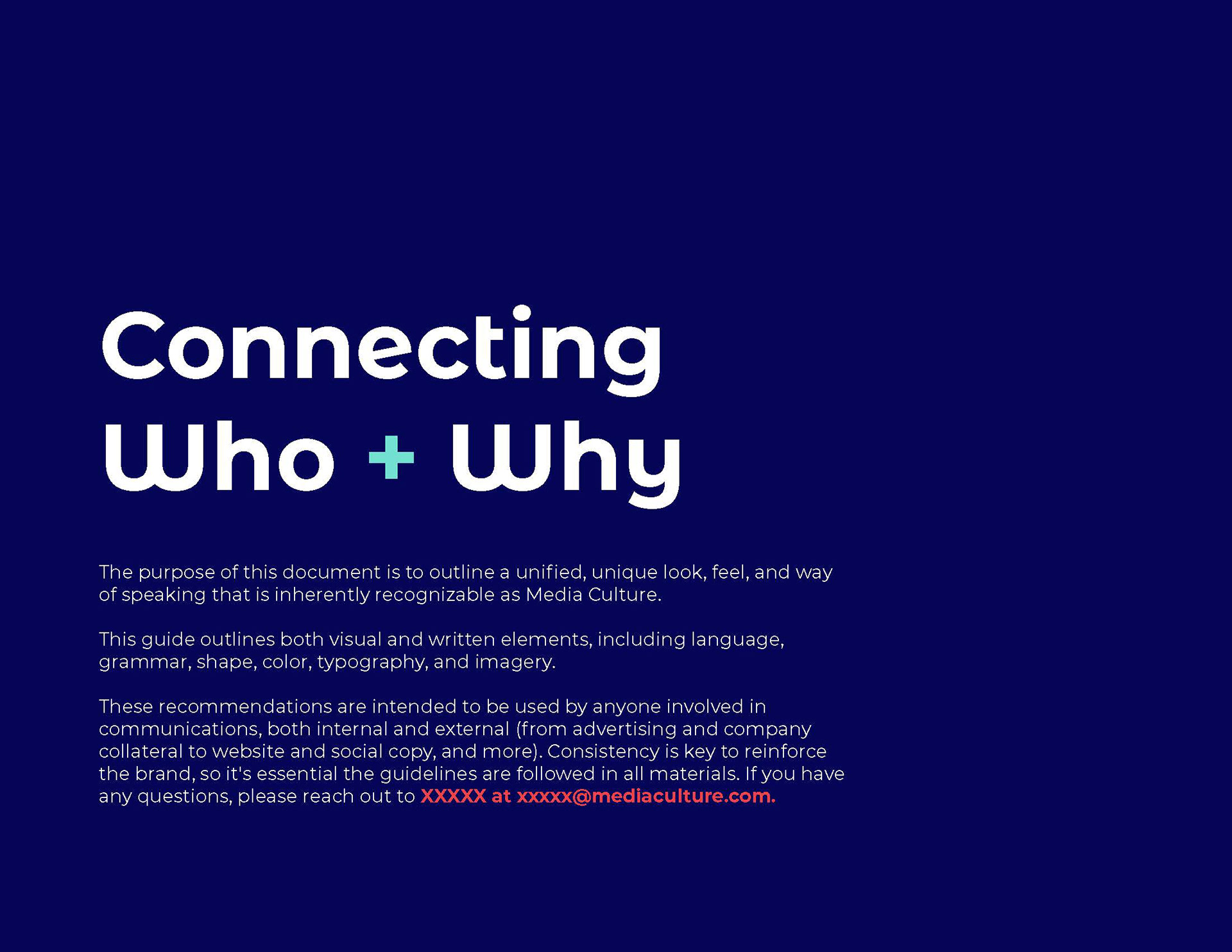
Client: Koeppel Direct/MediaCulture
Agency: Tier One Partners
Agency: Tier One Partners
logo design, branding
The client came to us with a big ask- they wanted to completely reinvent the company. From a new name and messaging to visual identity, website, and marketing collateral.
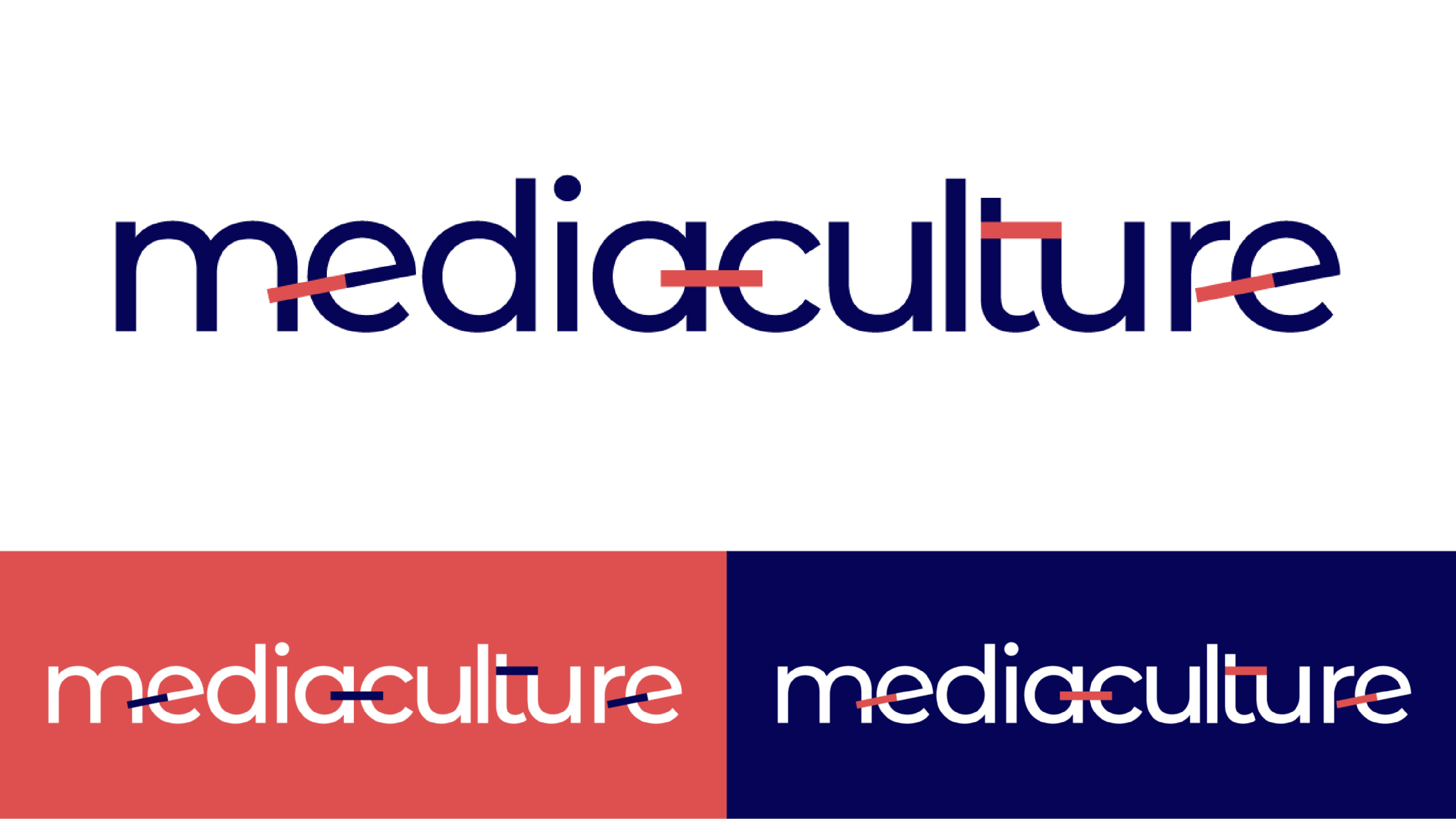
With a name change focusing on the the relationships of “Media” and “Culture”, the client wanted to put emphasis on the interconnectivity and bringing together these two most important aspects of the business.

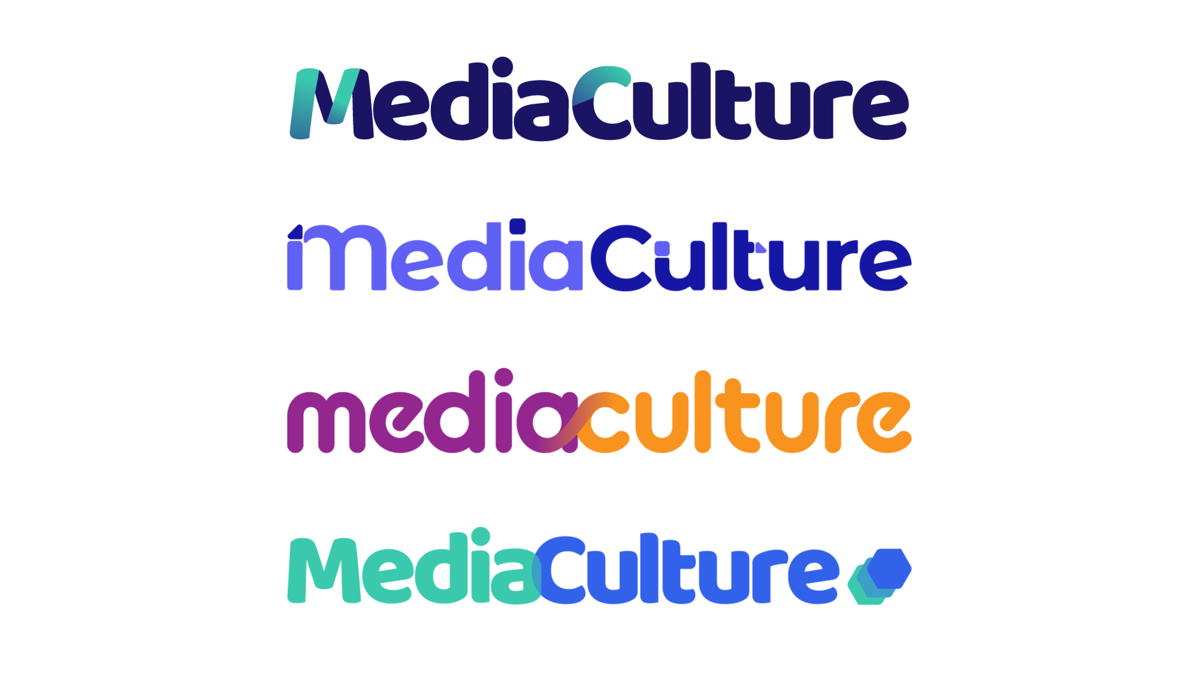
Starting with more abstract visualizations of connections, we determined with the client that they wanted a clear visual representation that didn’t require additional explanation. Below are a few of the scrapped concepts.
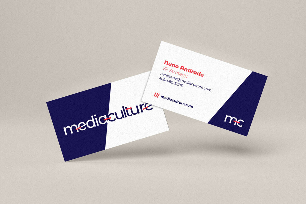
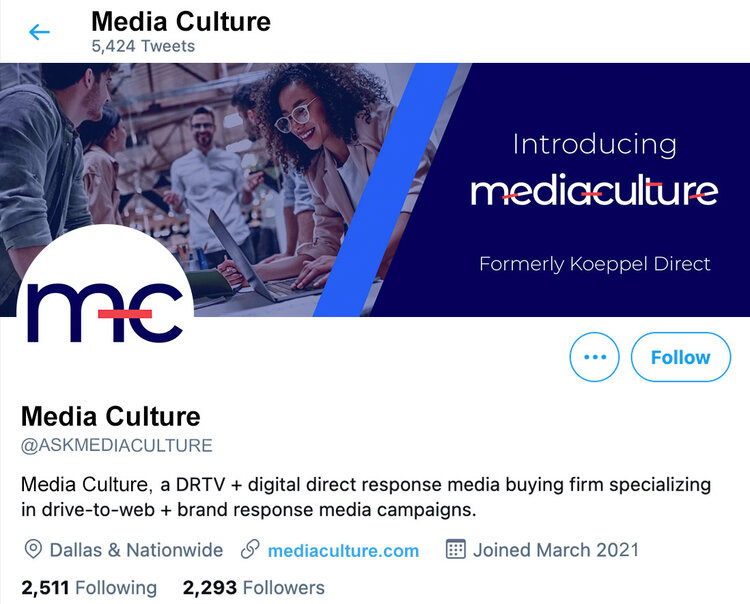
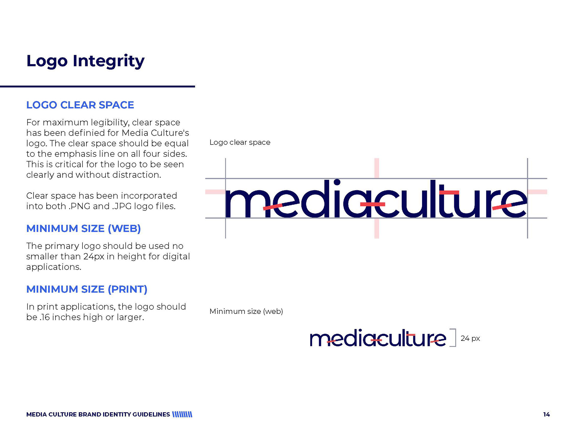
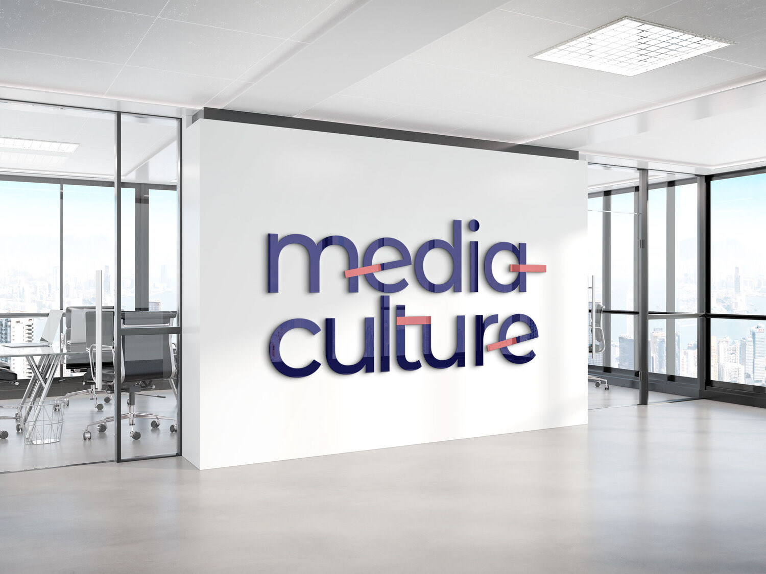
The client chose to go with a clean and modern logo design, featuring a pop of a Vivid Coral to complement the midnight blue. The exaggerated lines within the wordmark emphasize the connection of the two sides of the company.
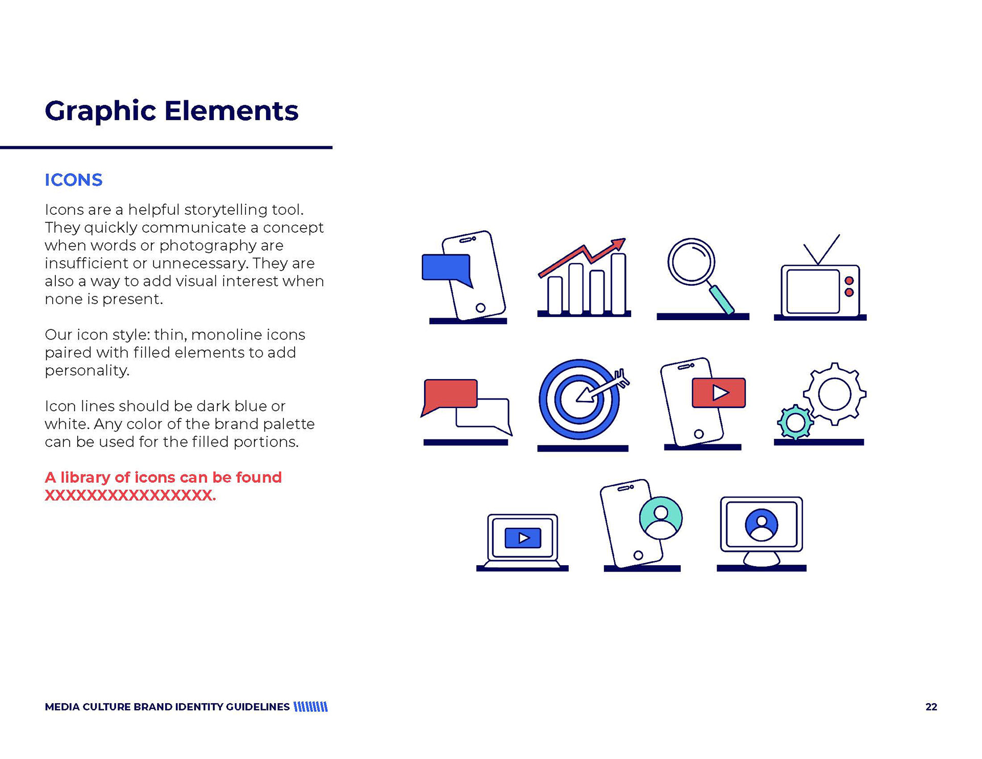
After a logo mark and color direction were decided on, we worked to expand the themes represented with an original look. This included an expanded color palette, choosing colors to complement the bold choices seen in the logo. This also included graphic elements and photography styles to drive home visual cohesion across all materials.